MIF Publishing House
IDENTITY COMMUNICATION
Previous logo
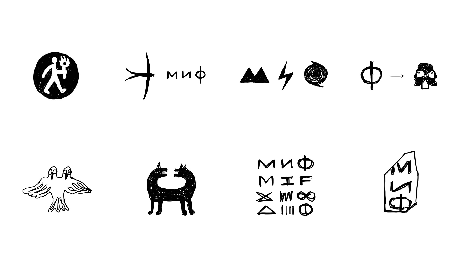
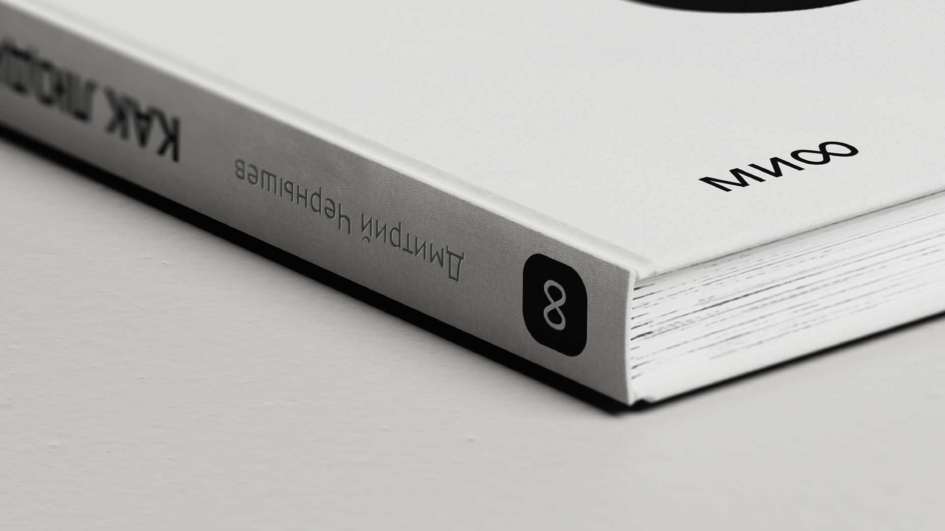
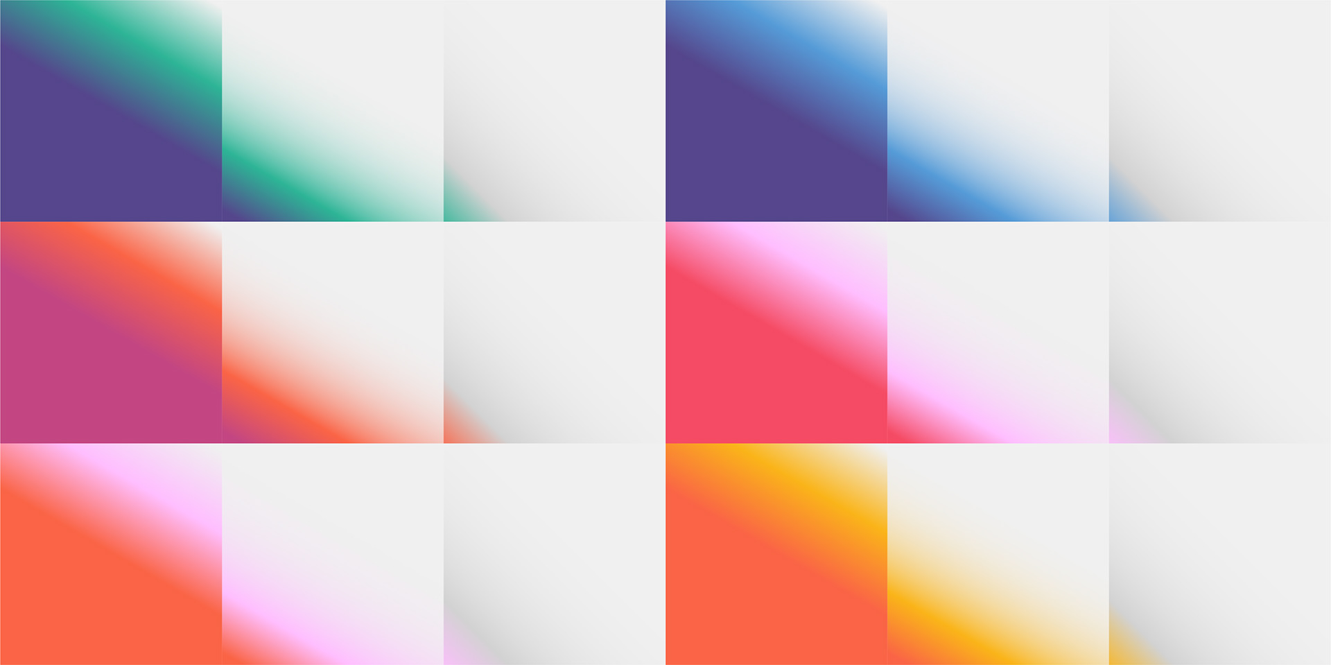
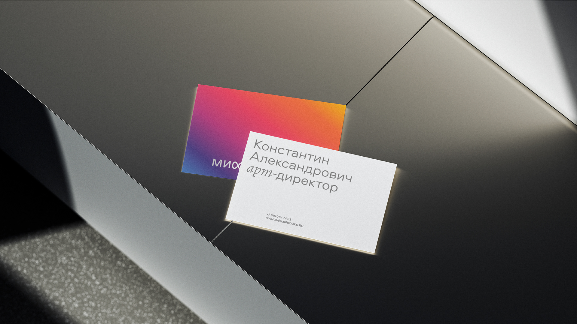
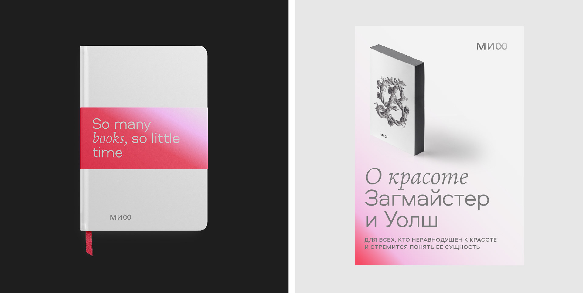
MIF is one of the biggest publishing houses in Russia, that publishes books of all kinds for adults and kids, but has a focus on self development and management books. The main visual asset the client wanted us to design was the logotype, and we went through many iterations of search process. Finally, we came up with the idea of the infinite growth, which became a Cyrillic letter Ф. (Unfortunately for MIF few months after the rebranding Meta also came up with the same symbol, yet MIF decided to stick to their new logo.) We’ve designed a system of brand graphics, color and typography principles, website look & feel and guidelines for using the logo on book covers and layouts.


email me at: hello@sashakoltsov.com