Skyeng School
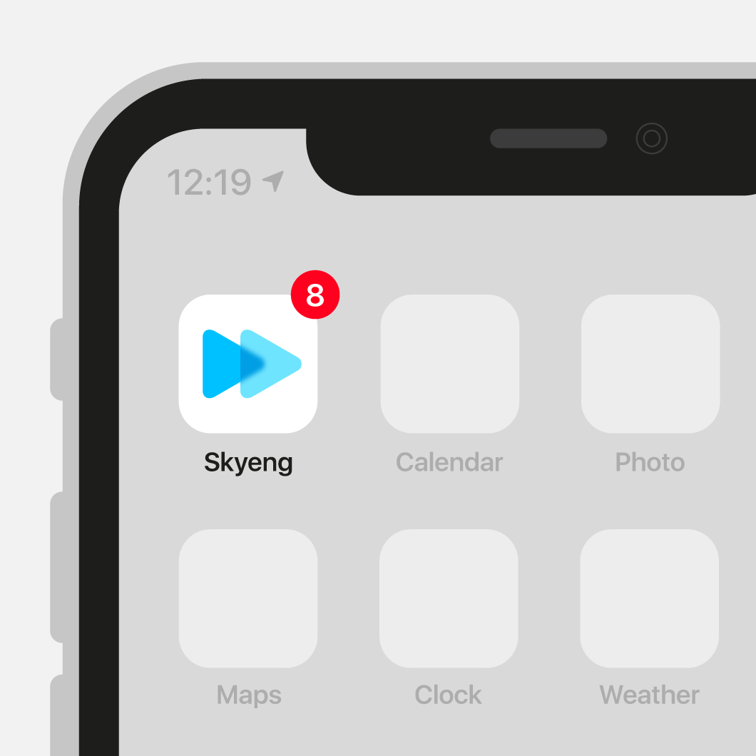
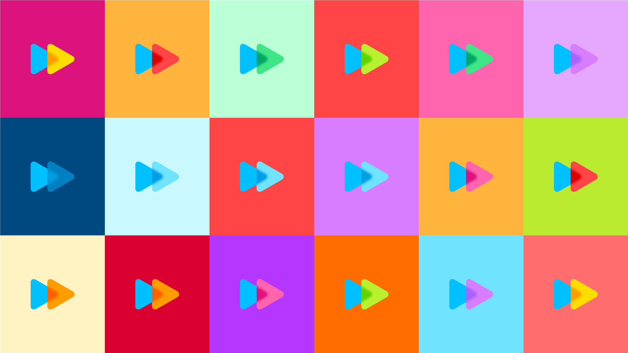
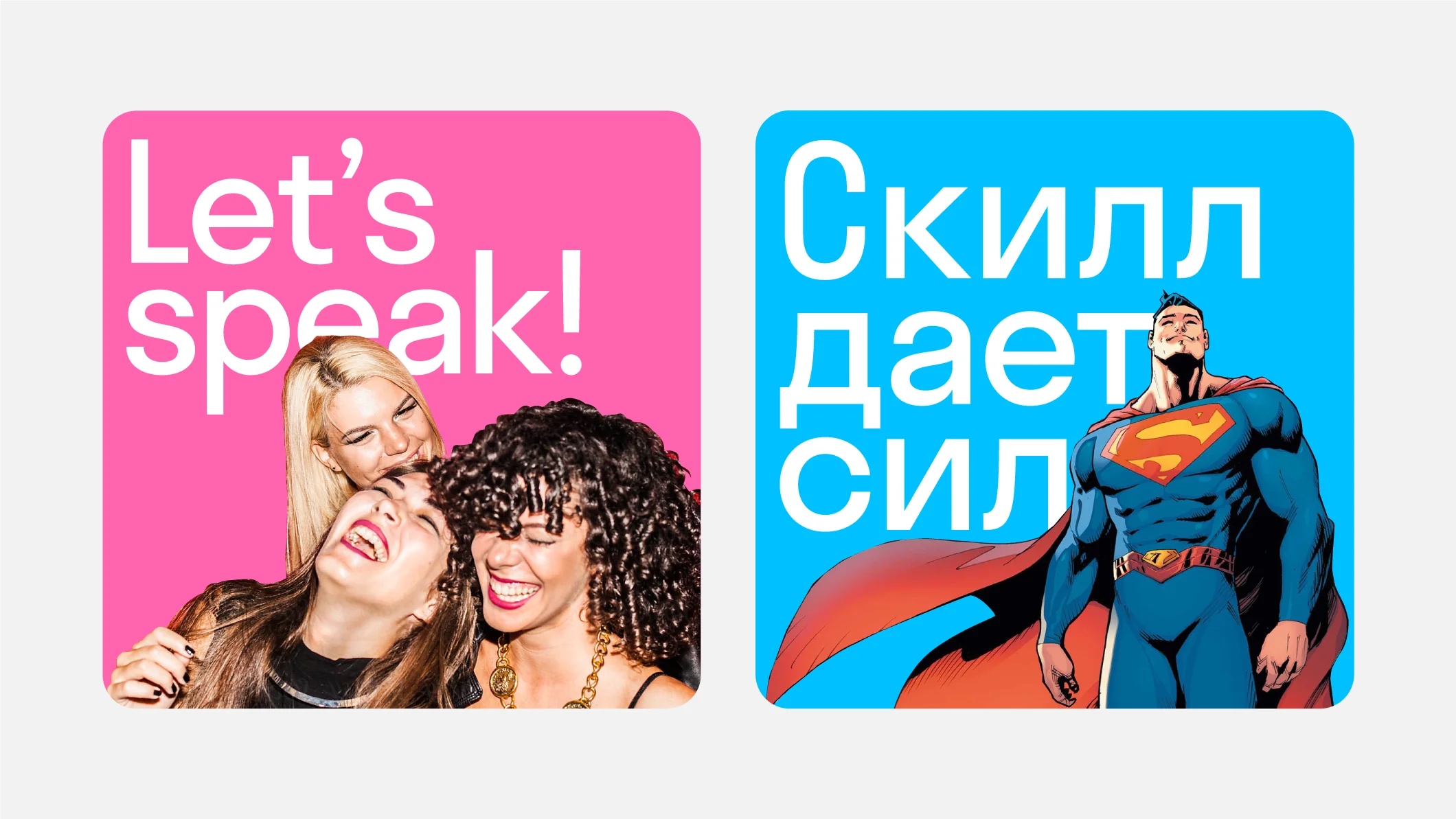
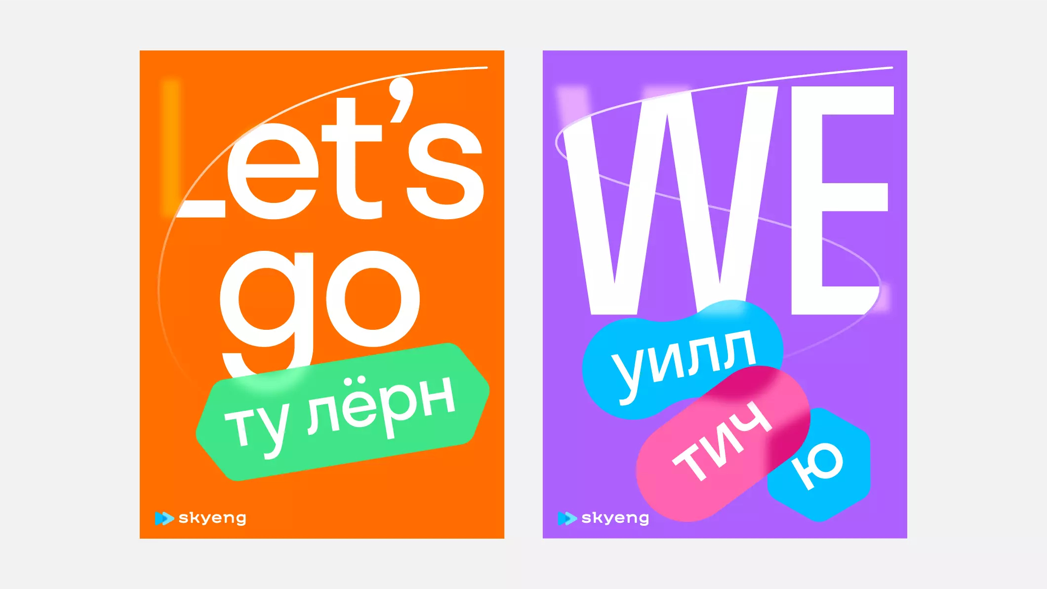
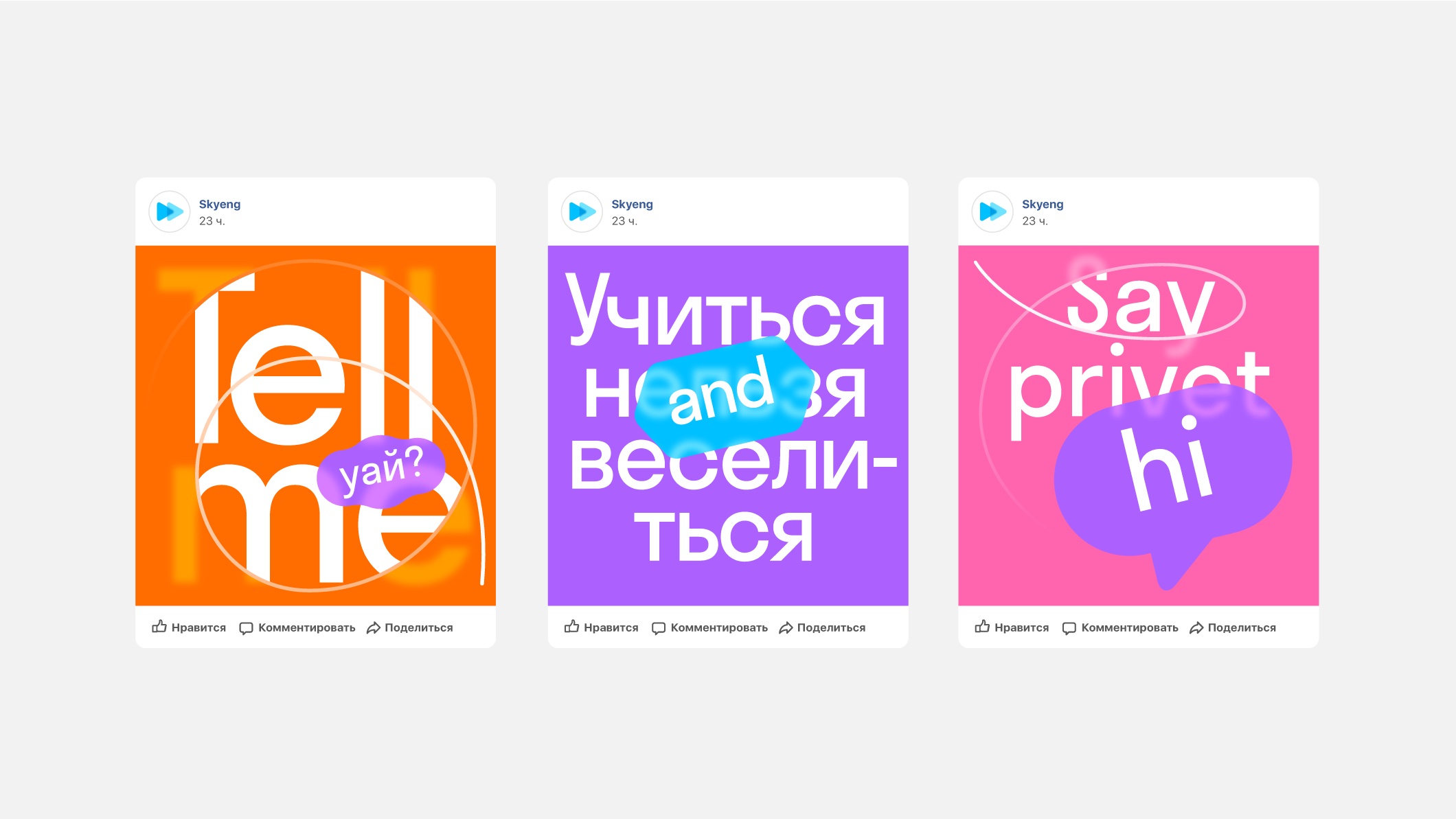
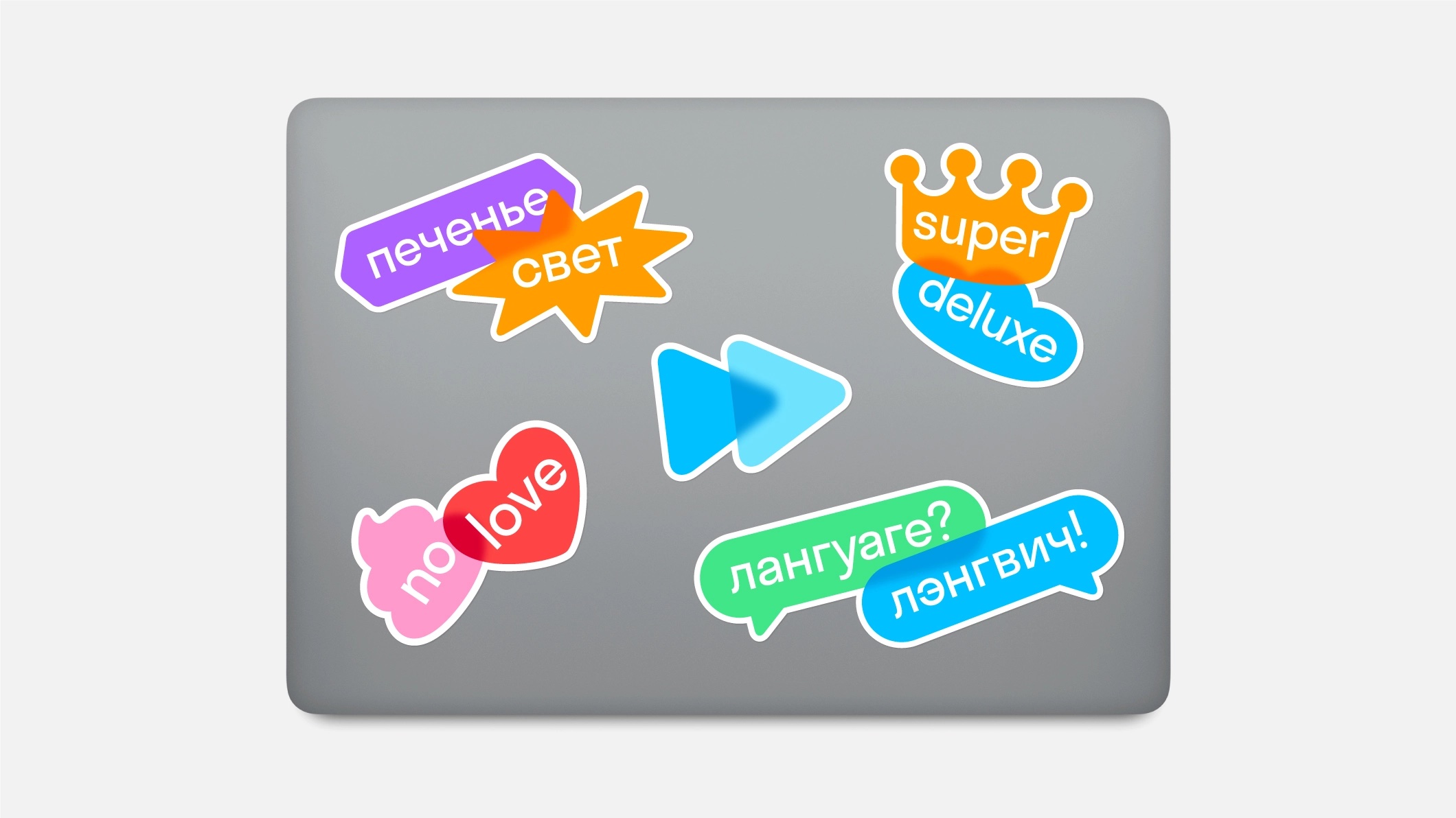
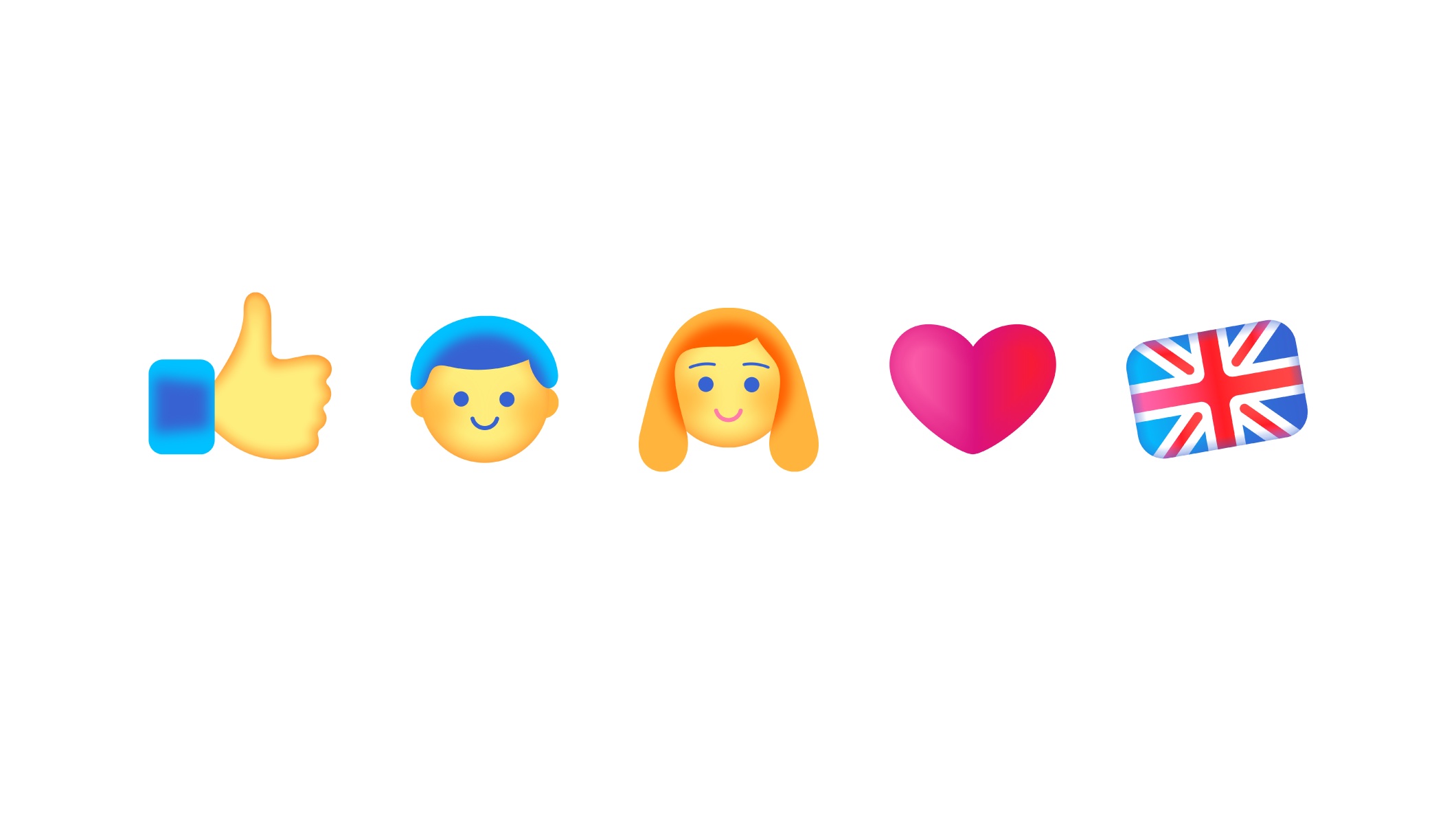
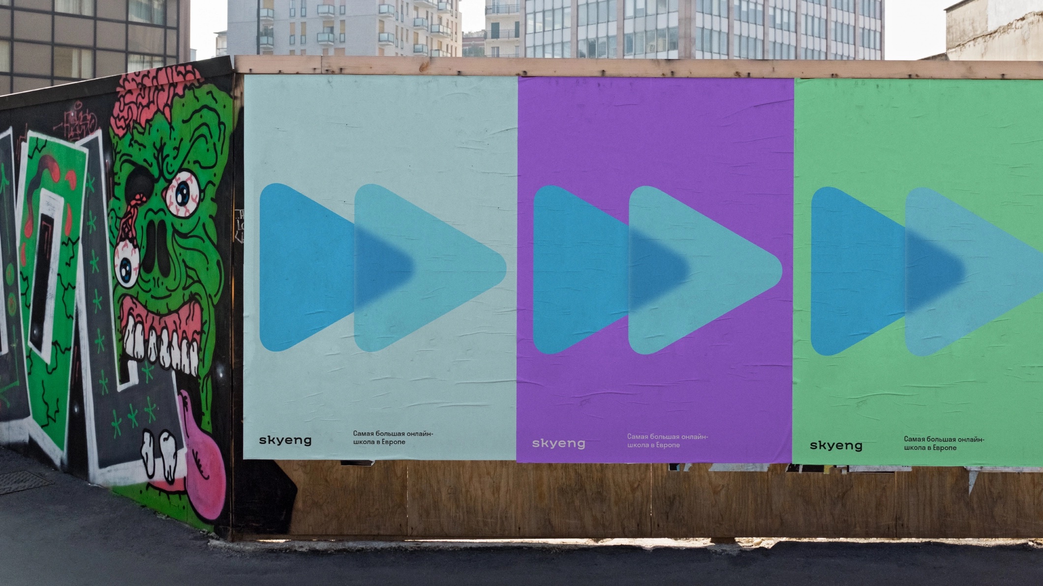
IDENTITY COMMUNICATION TYPE DESIGNSkyeng is an edtech company that has multiple branches for different audiences of kids and adults. My Shuka team developed a complex identity system with one core metaphor of synchronisation and acceleration in its center. The visual language consists of translucent layers of graphics, that combine to create new images and new meanings. In close collaboration with the client’s design team we’ve created the identity guidelines that include complex color principles, typography rules, examples and recommendations for creating illustrations, emojis and icons, UX/UI principles, photo, and motion style. We’ve also designed a custom typeface for setting the subbrand names.


email me at: hello@sashakoltsov.com